
Helping First Responders in Low-Resource environments
The brief
Neopenda is a social enterprise that aims to provide a 4-in-1 vital tracker for NICU (neonatal intensive care unit) patients in Uganda. My team and I were provided with the opportunity to recreate a practical, user-friendly vital monitoring dashboard for neonatal practitioners. Additionally, we developed a research plan for future testing with our end-users.
Platform
Android
Methods
Stakeholder, SME and End User Interviews + Heuristics Evaluation + Concept Testing
Team
Interaction Design + Research
Timeline
3 weeks
Addressing a global Issue
The last time I entered a NICU was the day I was born. I had a heart defect and was persistently monitored for the first six months of my life. Needless to say, when three of my teammates and I were assigned to work with Neopenda I was unaware of the unfortunate reality of neonatal deaths in developing countries like Uganda. In fact, nearly half of children’s deaths occur in the neonatal period, with the highest mortality rates in Southeast Asia and Africa (Unicef, 2018 & NIH, 2015). While infant mortality is overwhelmingly high, approximately 80% of these deaths are preventable with cost-effective treatments (Neopenda, 2016). Medical facilities in developing countries are generally ill-equipped and understaffed, and therefore can’t provide the bare necessities of health care such as consistent vital tracking. Because of this, an overwhelming majority of ill newborns often don’t receive the immediate medical attention they need.
Our clients, Sona Shah and Tess Cauvel, acknowledged this issue while working towards their Master’s in Biomedical Engineering and founded Neopenda in 2016. Neopenda’s first product is a vital tracker and monitor aiming to enhance the quality of care, decrease preventable deaths, and maximize neonatal practitioners’ limited resources.

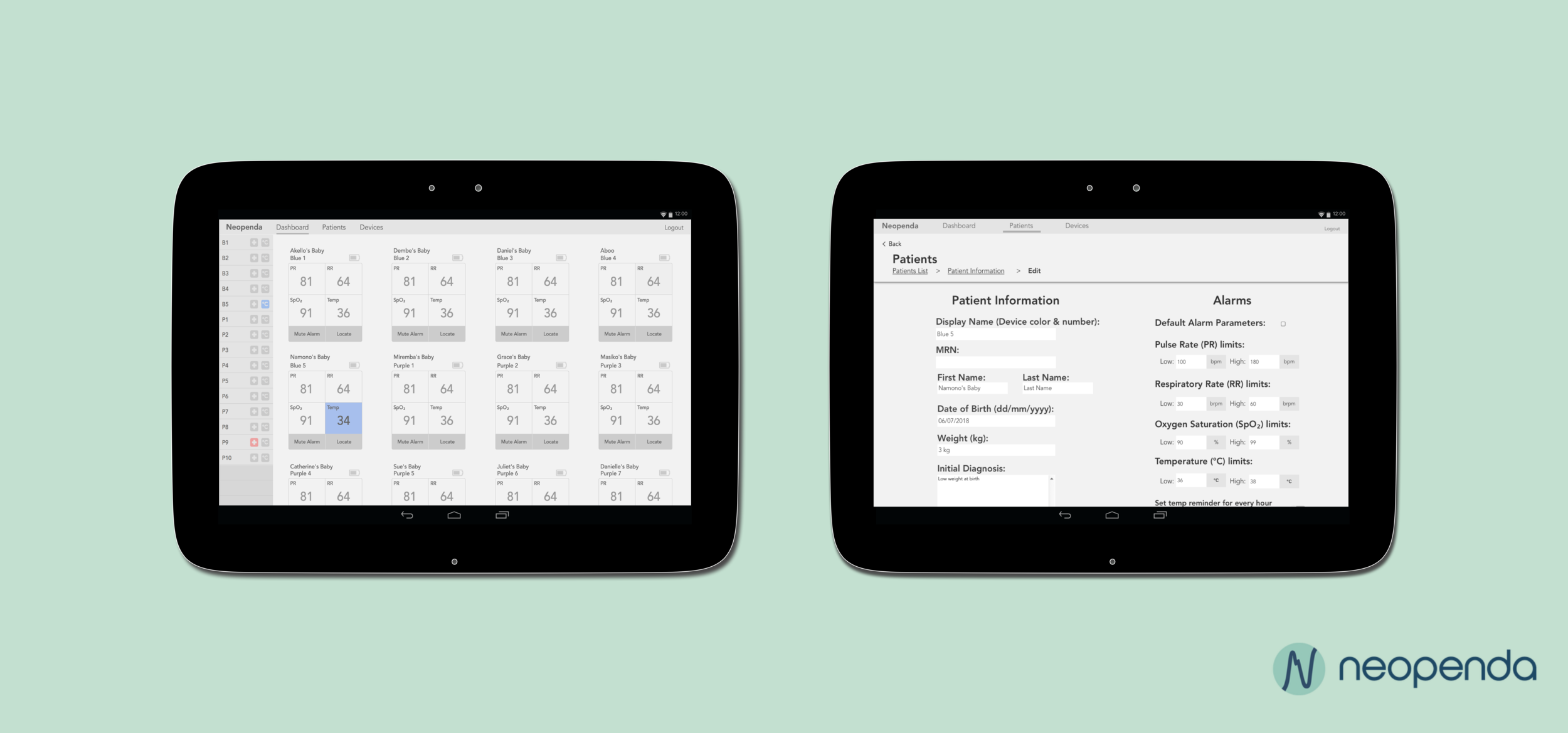
The baby’s vitals are measured from the headband, then appear on a dashboard updating in real time for practitioners to monitor. This is an early iteration of the dashboard that our client asked us to improve.
Photo courtesy of Neopenda
Coming into the project, Tess and Sona had two specific asks for us:

Narrowing the scope: How our clients viewed the issue
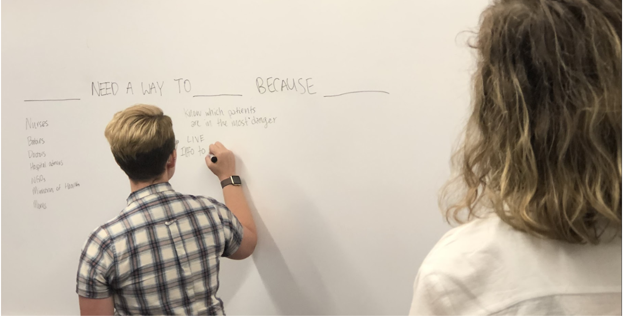
During the kick off, we learned that there were many moving parts and people who would be affected by this new medical technology. We sought out to understand more about our clients’ target audience with a problem statement exercise. While facilitating the discussion, I discovered that their solution not only helps babies, nurses’, and doctors’ in NICUs, but also offers valuable health data that doesn’t currently exist due to lack of information management systems and technology. Therefore, this product is in the interest of stakeholders such as ministries of health and NGOs as they work towards improving national budgets and policies to lower infant mortality rates.
Tess and I assessing audience needs from an individual to institutional level.
In the end, Tess and Sona agreed that the primary audience to focus on during the project were nurses. They serve as the first responders and make the most immediate impact on neonates’ lives.
This led to an initial problem statement:
“Nurses need a way to know which patients are in the most danger so that they can improve care, save lives, and be efficient, because they currently have too many tasks to manually take care of at once.”
Not only did the exercise ensure that our clients are on the same page, but it also provided us with initial insights into just how significant Ugandan nurses roles are in their patients lives as ‘first responders’. With our users mapped out, we were able to proceed with more direction in how to approach initial research and user interviews. That’s not to say that everything was smooth sailing.
Some assumptions and challenges were evident early on:
Figuring out how to create a flexible interface that could house 1-100 patients vitals
Understanding medical landscapes and jargon to speak with users
Developing a life-changing product with a lack of end users
Building a product suited for a low-resource environment
Diving deeper into neonatal care, competition & the original prototype
Desk Research
In order to understand the context the product is intended to function in, I set out to research medical landscapes in low-resource environments and neonatology care. Initial fieldwork included neonatal terminology, vital monitoring information, low-resource environments in the context of healthcare, and medical equipment in NICUs in developed countries (primarily the U.S.) vs Uganda. Being equipped with this information provided us with a baseline knowledge and language to have when speaking with neonatal doctors’, nurses’, and our clients, who were already well-versed in the field. This knowledge also allowed us to empathize and begin to comprehend the conditions that NICU nurses work in.
With the initial impression that the device had to be flexible enough to accommodate from 10- 100 patients, my teammate Jason and I sought out data visualizations. We saw it as valuable in determining alternative ways to display a lot of information in the most digestible way possible. He drew inspiration from the stock market and airline information screens. Together we hypothesized that a card layout was the most aesthetically pleasing way to display pertinent patient information, which is what the current platform currently uses.

A neonatal health journey display effectively utilizes whitespace and visual indications of abnormal vitals.

A stock market ticker that demonstrates an alternative way to display comprehensive amounts of information and trends.
What competitors are doing
Our clients already had a thorough understanding of direct competitors’ business models in the wearable device industry. My teammates Jacqueline and Michelle leveraged the businesses that our clients were already familiar of and conducted a competitive analysis from a design perspective. Taking this approach helped us gain inspiration and understand data storage, vital monitoring displays, and how urgency can appear on a screen.
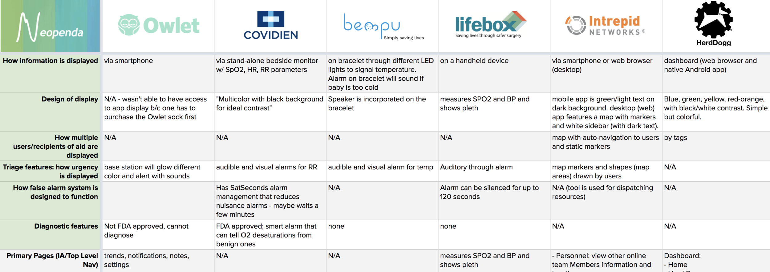
What we learned from direct competition:
Bempu's alarm only triggers when the baby is too cold to signal potential hypothermia. This was useful later in the design process as we validated nurses’ concerns for false alarms.
Lifebox provided us with a standard for false alarm parameters with a 120 second mute.
Competitors visualized vital data on a pleth, imitating U.S. medical standards.
The majority of the equipment in Ugandan hospitals consists of older and nearly retired equipment from the U.S. and U.K.. While none of these competitors operate in African markets, it was important to understand the function and aesthetics of U.S. and U.K. medical technology since Ugandan practitioners are familiar with it.
What we learned from indirect competition:

HerdDogg’s platform specializes in overseeing herd health and capturing data for cattle ranchers.

Intrepid Networks platform, offers location tracking and instantaneous communication for teams in crisis situations.
Additional indirect competitors from the agricultural and first responder sector were selected. HerdDogg and Intrepid Networks’ platforms improved our understanding of how to auto-locate individuals and track and label the health of a vast number of individuals, which we deemed as very useful in overcrowded NICUs. Its main functions inspired our ideas during concept designing and inevitably our solution.
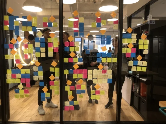
Heuristics evaluation
After taking a look at Neopenda’s competitors and design inspirations, we set out to test the usability of the dashboard in its current state (seen below) to discover issues and potential ways to improve the design with a heuristic evaluation. This was a good opportunity to educate our clients on some of the usability standards and also use this as a preventative measure on how we could design to limit error prevention and clean up the aesthetics.

Primary screens of the original beta we tested and rebuilt. We had to shift our mindset from clicks to taps since the original prototype lived in a laptop before Tess and Sona decided on an Android tablet.
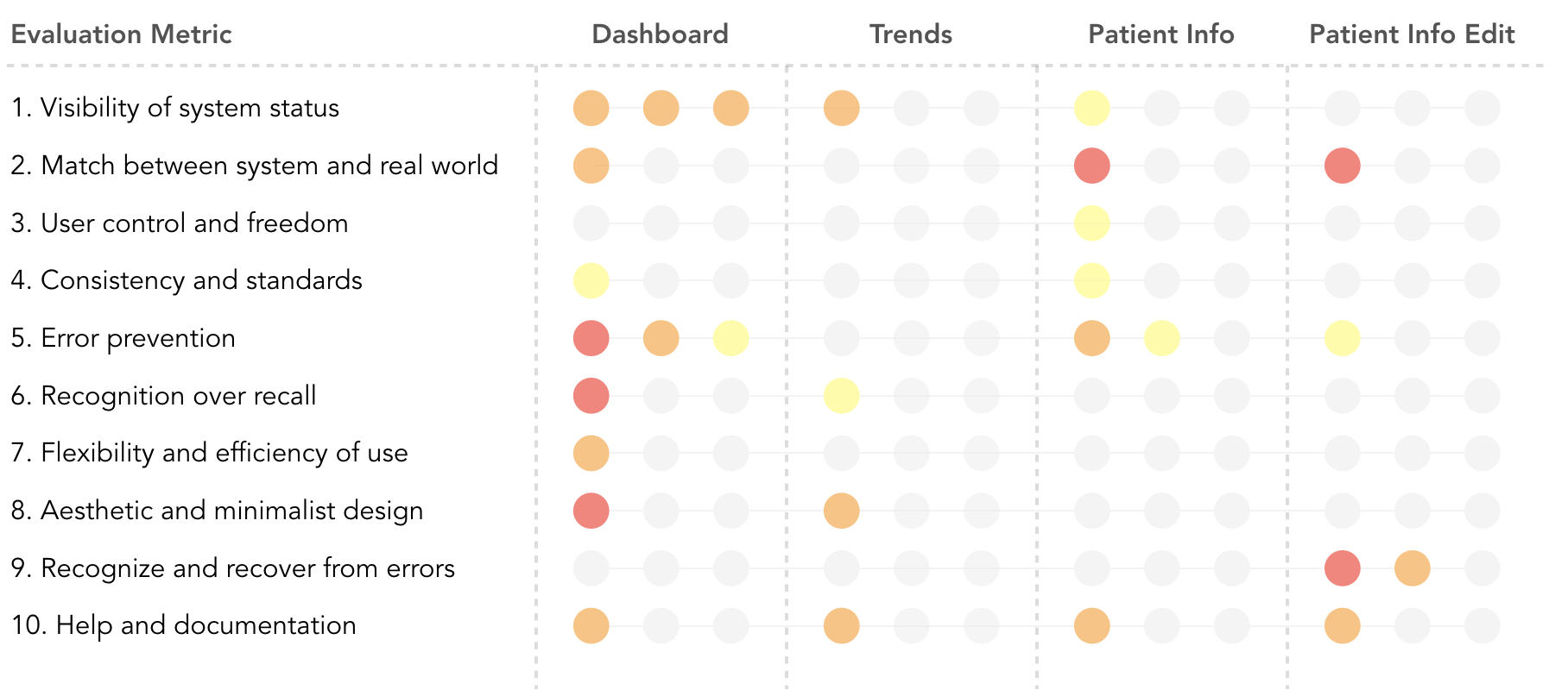
Key takeaways:
Vital cards lack visual hierarchy and are cluttered with information and icons.
Display name of patient by bed is not the most informative nomenclature to nurses since babies move around frequently and beds are shared often.
The platform lacks validation upon entering patient information and vital parameters.
Observing the platform from a usability perspective revealed the challenge of creating a flexible design allowing nurses to assess and identify patients within various NICU environments, in addition to establishing vital parameters that work for the nurse and the patient.
Understanding our users & the environment
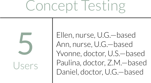
Our clients set up remote interviews with neonatal nurses’ and doctors’ with varying responsibilities and roles around the U.S., Uganda (U.G.), and Zambia (Z.A). All but one interview was conducted remotely through the entire project. Due to technological capabilities and geographic locations of the users, talking with them took many different forms—WhatsApp video and audio calls to Uganda, Skype, Zoom, FaceTime, Google Hangouts, emails, and many failed attempts. Talking with users was a challenge to say the least, but gave us a reason to get scrappy!
To utilize our limited time, we conducted user and SME interviews with the expectation to gain a more comprehensive understanding of nurses’ experiences in the NICU. This encompassed learning about:

NICU environments in Uganda
The difference between nurse and doctor roles
How nurses currently respond to emergencies
Initial reactions to the current interface

Dr. Daniel gave us a tour through Potter’s Village NICU in Kisoro, Uganda. We used these visual depictions to understand the diverse environments to design for.

My teammate Jacqueline discussing NICU nursing roles, responsibilities, and environments with Nurse Ellen, a reoccurring user and SME who works part time in Mulago’s NICU the national referral hospital in Uganda.
We were surprised by how different the answers were from each practitioner. We attributed this to their professional background and associated location depending on the amount of time the individual had spent in Uganda and how closely they worked with nurses in NICUs. This led to us synthesizing our findings by insights into two perspectives- exposure and involvement in Uganda (low resource setting) and practitioner role (nurse or doctor). By doing this, we were able to contextualize information and prioritize findings from nurses and people exposed to low-resource environments.
Discussing our insights on themes to prioritize helped us empathize with each other as designers, as we uncovered our individual assumptions and thought process behind our votes.
In order to prioritize and align as a group, we decided to take a vote on the top 5 topics we individually saw as important, then defended each of our decisions.
As a group, we landed on 4 emerging trends:

Current Interface
After showing the initial prototype, users said the visual cues, such as the numbers displaying as red, were preferred over auditory alarms. The patient information was crowded and difficult to scan. Practitioners who worked in Ugandan NICUs didn’t find the bed labeling to be feasible if the physical layout didn’t allow for it which posed as an interesting design challenge for us.

Locating Patients
We thought understanding how a baby should be recognized in the system to complement a nurses workflow should be a top priority. We learned that Ugandan NICUs’ patient capacity varies from location and equipment is often shared with up to 5-6 babies positioned on a single bed. Though nurses try to put the sickest babies near each other, there is a lack of organization and resources as babies get shifted around. Patients are frequently identified by the records left on top of them or by wristbands that state the mothers name.

Record Keeping
Record keeping was particularly important to Tess and Sona since they revealed that there is no streamlined process or patient information management system. It takes approximately 20 minutes to track a patient's vitals and nurses don’t usually have the time or resources (even paper!) to consistently record vitals. Vitals are often fabricated so they don’t lose their jobs. This leads to practitioners making life altering decisions based on assumptions.

Alarm Settings
A primary feature of the platform is to alert nurses when an abnormal vital occurs. The users we spoke to were concerned about false alarms and talked about how they typically muted alarm notifications because of noise fatigue. In the U.S., it’s the standard to account for the possibility of false alarms and program monitoring equipment to disable alarms for a set period of time. When a healthcare provider silences an alarm, muted for 3 minutes max; this is particularly useful for respiratory rate. Lastly, doctors mentioned that nurses know equipment better, and set parameters based on the neonate’s age.
Refining the problem
After gathering additional insights from SMEs and users, we were able to hone in on the specific needs of Ugandan NICU nurses.
There is currently a lack of medical equipment, space, and staff in low-resource environments.
Neonatal nurses in low-resource environments need a way to efficiently scan vital monitoring information and find neonates in critical condition so that they can channel their energy to the child with the most need.
To design with our audience in mind, we created four principles that guided our decision-making.

While it was evident that we needed to build a product that allows nurses to scan and find patients, the design principles allowed us to prioritize our decisions based on user research. They came in handy when faced with synthesizing varying opinions during testing. These also serve as a tool for future designers to reference when continuing our work.
This was an aspect of the design I pushed once a user recommended using band colors to help nurses find babies. These colors could be based on gestational age, which also suggests different health conditions; for instance, a preemie is more subjected to hypothermia or asphyxia than a full-term baby. After further exploration, I discovered that it could potentially be designed with different sizes to help with comfort and fit of the band since the circumference of a neonate’s head can range from 20-35 cm on average. Our client was really fond of the idea, which influenced the design of the dashboard.
Exploring our options
With the information from user research, we sought out to create potential creative solutions. As a team, we conducted exercises to solve for the problem statement of creating a scannable and findable solution and used the design principles to keep in mind.

Facilitating brutethink exercises with the team in search for potential solutions to focus on scannable data visualizations, alarm parameters, patient information, and patient nomenclatures.
Alternative Solutions
After creating four concepts, we sought out to test each concept with the goals to:
Eliminate underperforming concepts
Assess the user’s understanding of what problem each concept addresses
Understand the user’s mental models for tasks / features
Collect open-ended feedback about user ideas / wants / needs
Concept 1: Moving Map

We learned that identifying a baby’s location when they need immediate attention was a major challenge. Excited with the opportunity to design for functionality in various room layouts, I created a moving map to display a customizable quadrant layout that enables nurses to drag vital cards to correspond with patients location. I drew inspiration from Intrepid’s use of map markers and the project management tool, Trello. The quadrant requiring the most assistance highlighted to direct the nurse to the right direction. While this was novel to users, it simply wasn’t feasible for the various NICU setups and nurses routine. The concept was tested with 2 users before it was removed.
“Things aren’t shaped so nicely into four quadrants.””
Concept 2: Queue Up

Taken from design inspiration of flight information displays, we wanted to test a vertical orientation with rotating cards so nurses wouldn’t have to scroll to find patient information. I created the idea of a prioritization based off of waiting lines in customer service that would queue cards with abnormal vitals to help call attention to babies in distress. My teammate Jason designed the layout and added a ‘Find’ CTA so the nurse could locate a baby, similar to the ‘Find my iPhone’ feature. The ‘Find’ feature and medical prioritization was positively received.
“Babies get moved all the time... I see the advantage [of having a ‘find’ button].”
Concept 3: Don’t Snooze

The idea behind ‘Don’t Snooze’ was to create a display informing the user how long a baby had abnormal vitals. Jacqueline incorporated features such as an alarm time tracker, a diamond vital card layout to test out the scannability, a tooltip popup to hide patient information and trends, and a different trends view by tapping cards. The baby label vague to Baby ID 1, to inspire creative ideas different from labeling that corresponded with the hardware.
“Nurses don’t have time to look at trends or take notes.”
Concept 4: Dynamic List

Inspired by stock market displays, ‘Dynamic List’ was intended to display as many patient vitals on a single screen as possible. It includes a vertical orientation with vitals in a horizontal arrangement. My teammate Michelle created it with the intention of testing sparklines that imitates graphs on monitoring equipment to determine if this was digestible and useful to our users.
“When you have a long list like that… it’s a little crazy.”
Concept 5: Switchboard

The creation of Switchboard was influenced from Dr. Yvonne’s recommendation to include a high level patient overview. The idea behind the concept is to display labeled buttons of every patient in a sidebar, and once the baby is in distress it would trigger a visual cue for the nurse to then tap on to the patient's vitals. This allowed for the nurse to see a comprehensive list of all of their patients, while not overwhelming them with information. While helpful, this was certainly overwhelming for users. Built into the card is also a baby location dropdown nurses could populate to communicate what type of equipment the baby is on- bed, incubator, phototherapy bed—too much unnecessary information.
“It’s important for the alarms to show the culprit.”
Converging ideas
During concept testing it became clear there was no definitive winning idea. It was challenging to choose between certain features because we received contradicting feedback that stemmed from their professional backgrounds
1. No time for details. U.S. based practitioners preferred to see more detail oriented features. On the other hand, the nurses and individuals who worked alongside with Ugandan practitioners didn’t see the details as functional or complementary to NICU nurses routine. They were more concerned with immediate assessment and response.
2. Not all vital signs are treated equally. Users mentioned that we should be mindful when creating alarm notification systems. Some vital signs take longer to normalize than others. For instance, if a baby is too hot or cold, their temperature should alter 1/2 degree every hour, while a baby’s respiration rate can fluctuate frequently due to excitement or movement. When faced with treating multiple patients at once, nurses must choose the most threatening prospect. It’s important that we acknowledge this from a design standpoint moving forward.
We took a leap with the fifth concept switchboard to provide a comprehensive overview of patients on the dashboard via a sidebar with patient info buttons. While aesthetically users declared it looked overwhelming, the idea behind the concept addressed nurses top priority. The next step was to create and test a cleaner looking dashboard with incorporate features that tested well in other concepts:
Tooltip hiding the ‘Trends’ and ‘Patient Info’ buttons
Highlight vitals
Show battery life
‘Locate’ button
Temperature vital should be different from the other 3 vitals to reduce noise fatigue
Comprehensive overview of patient list
Trends: show sidebar of vitals and use modal
Rebuilding a Practical Solution
Once the wireframes were built out, we were still curious about how the product would function within the setting of an Ugandan NICU. In order to gain a better understanding, we were encouraged by our creative director, Dan, to draw out task flows. We mapped out scenarios nurses would find themselves in based off of a workflow we were already familiar with to contextualize the users experience with the product. Doing this as a team validated assumptions on what information and features to include in our prototype and also influenced the tasks and scenarios users would be asked to perform during usability testing.

Nurses task flows involved (1) monitoring abnormal vitals, (2) viewing patient information and trends, (3) editing alarm parameters, and (4) adding and discharging patients.
Throughout the project we had many issues connecting with our end users due to technological constraints like the network connection, lack of wifi, and coordinating with an 8-hour time difference. Originally we had intended to test the prototype with 7 participants, however we ran into the same problems and were able to only speak with 4 neonatal practitioners. While we lacked gaining the perspective of our end user, we were still able to test the usability of a new concept. From that we went into testing with the goals to:

Discover if the updates dashboard assists users in easily scanning vitals
Assess if sidebar helps or hinders nurses workflow
Determine how users respond to temperature alerts, and
Iterate the prototype based on feedback
Monitoring abnormal vitals

Usability testing revealed:
The sidebar provides cues to allow for a quick assessment of vitals but needs to be more apparent.
‘Trends’ and ‘Patient Info and Alarms’ in tooltip was intuitive for users to find.
The utility of ‘Mute Alarm’ and ‘Locate’ features were validated.
Auto-scroll is an effective approach for finding and assessing vitals of a patient in need.
Viewing patient information and trends

Usability testing revealed:
Switch view option of showing all vitals at once would be helpful to expose correlations for triage.
The high and low parameters lines helped limit cognitive load in reviewing patients vitals.
Editing patient vitals

Usability testing revealed:
Unlike other vitals, the ability to set temperature reminder can significantly reduce noise fatigue since, unlike SPO2, PR, and RR, it can take hours to regulate.
Adding and discharging a patient
Usability testing revealed:
Alarm parameters should auto-populate based on gestational age since preterm and full term babies have different vital ranges. This can reduce cognitive load and patient admittance time.

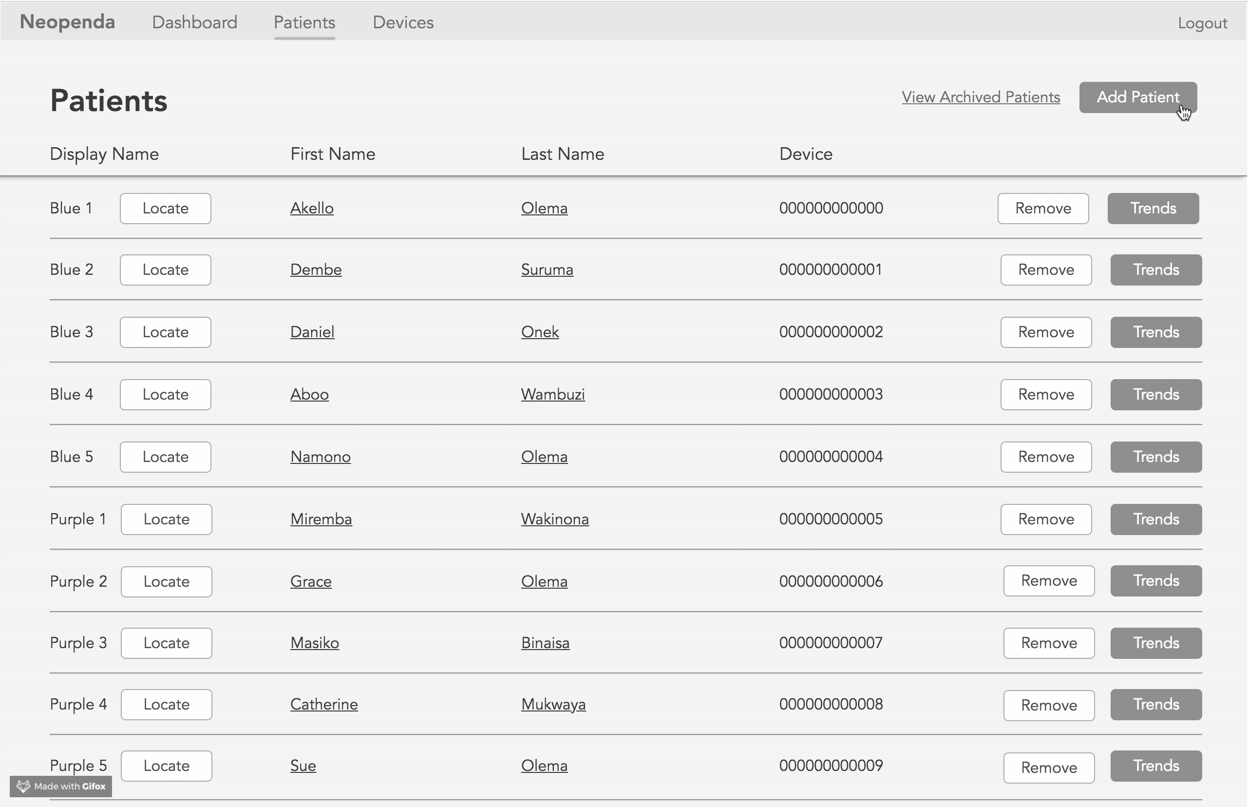
Initially we used the wording ‘Archive’ on the current ‘Remove’ CTA. We found that the wording was confusing for users.
Adding the sex of the baby helps to ensure users are viewing the right patient.
“Even if you don’t know exactly what to do, you could click around and figure it out pretty quickly.”
“This should be very easy for them to figure out.”
All users mentioned the anticipated learning curve with medical equipment and thought it was relatively intuitive and user-friendly. Needless to say, there were still changes to be made to cut down on the users cognitive load. Although we continued to receive contradicting insights from the users, prioritizing nurses’ needs in developing NICUs and how it complements their mental model of current medical equipment enabled us to move forward with specific changes over others. The iterations ultimately led to a stronger product that was ready to begin testing in Uganda.
After revealing our solution to Tess and Sona, they were pleased with what we had accomplished in 3 weeks! Some of our suggestions such as introducing multiple colored headbands, also led to some interesting conversations around business constraints and viable options that weren’t posed before. Sona and Tess were also really intrigued by the data we collected from our user pool and thought the redesign of their platform had thoughtfully prioritized nurses. With many questions left unanswered by the end users, they were also impressed with the test plan we had created for them.
Moving the product forward
Iterations
Tess expressed interest in implementing our recommendations to the prototype in stages. We prioritized iterations based off of the user feedback we received during concept and usability testing that enabled nurses to easily scan vitals and find patients in the physical space.

Continued Research
From the start, we were told it would be difficult to speak with real users of Neopenda’s product. This left gaps in our research as we still had many unanswered questions around how the product would function in Ugandan NICUs from the average to worst case scenario. With that in mind, our clients knew testing should be ongoing after our 3 weeks working together to validate or disprove design decisions made based on feedback from neonatal practitioners we spoke with. We created an usability test plan to allow future researchers to pick up where we left off. I sought out inspiration from the Nielsen Norman Group to create an easy-to-use template for non-UX and ESL users to comprehend, with the intention that it should be modular and applicable in a variety of contexts.
The recommendations we advised provided Tess and Sona with additional insights that they weren’t aware of prior. While this hasn’t been tested out in the wild, I believe this made for a stronger and more considerate product for nurses’ working in hectic environments. I’m looking forward to receiving updates about the data they collect during testing in the fall!
Lessons learned
Designing around assumptions. Building products used by first responders was an intimidating experience, to be honest. However, conducting user researching within strict geographical and technical confines enabled me to build confidence in facilitating important conversations surrounding environmental considerations, technical feasibility, and novel ideas that affect different components of the product. Aspects of the project that may have seemed challenging, instead provided additional opportunities as a team and individually. For instance, the limitations of the project enabled me to focus on my passion for research and develop a research template for native Ugandans to use. These were invaluable lessons to learn early on in my career.
Viewing limitations as inspiration. This was my first project working with medical equipment and exposed the reality of designing with regulations and physical environments. Throughout the project, we discussed playing around with the LED lights and auditory alarms for notification systems. There was some uncertainty of whether it would be feasible with regulatory standpoint. From feedback, I had to shift my mindset away from having more flexibility with how creative certain features could get at times and instead refer back to medical standards. This also meant practical and appropriate for the environment at times. Since stealing and lack of resources were a legitimate concern, we had to question the practicality of certain features, where the tablet itself would be stationed or how a single nurse on duty would respond if multiple babies appeared to need attention.
Participating in your passion project. More importantly, working on this project reaffirmed my role and purpose as a researcher and designer. It’s a privilege to have worked with passionate individuals whose intention in the products they create is to save and improve lives. The project particularly hit close to home because I was born with serious heart defects and was monitored daily for the first 6 months of my life. It was my past the led me to wanting to work in the medical field and it’s projects like these that perpetuate it.
Thanks for making it this far!
Feel free to contact me at hello@ashlynndenny.co if you have any thoughts, questions or feedback.